
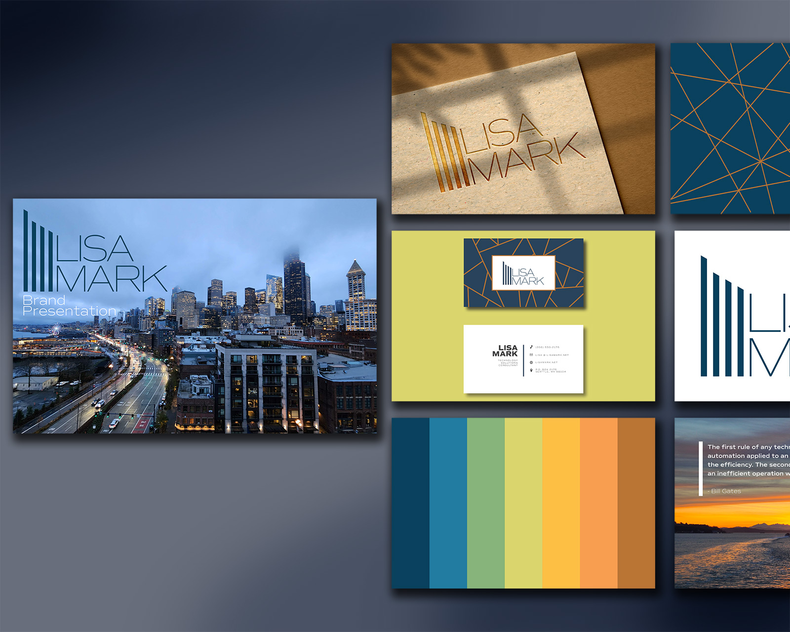


Creating a Brand That’s Rooted in Place
Lisa Mark was launching a new consulting business in Seattle and needed a brand that would stand out in a crowded market. The challenge was to create an identity that was both sophisticated and flexible enough to grow with the business, while also capturing the unique spirit of the Pacific Northwest.
My Solution
To solve this, I designed a brand identity that visually evokes the Seattle region without relying on prominent landmarks. The logo uses the letters “L” and “M” to create an abstract, geometric skyline.
I chose a color palette that evokes the local landscape: rich blues from the Puget Sound, deep greens from the region’s forests, and vibrant oranges from the stunning sunrises and sunsets. The final brand identity provides a solid, memorable foundation for the new business, reflecting both its local roots and its professional aspirations.





Field
Small Business
Services
Brand Development, Graphic Design, Print Collateral, Photography