
Designer’s Eye.
Twenty-five years of looking at things for a living has a side effect: I can’t turn it off. Wherever I travel (and when I travel), I end up photographing the same things that show up in my client work. Colors. Signage systems. Wayfinding. Architecture. Typography nobody designed on purpose. Reflections. The small, specific decisions that make a public space feel like it was built by someone who cared, or wasn’t.
This page is that archive. Not a portfolio, just the eye, off the clock.

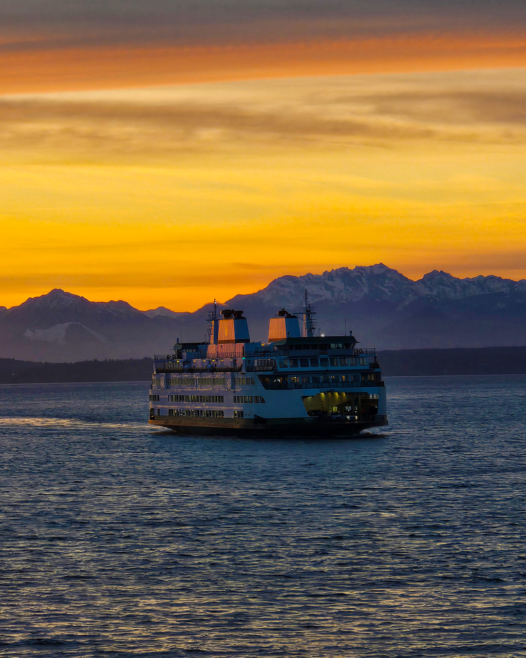
Not every transit decision is made on land. A Washington State ferry heads out at dusk with the Olympics catching the last light.
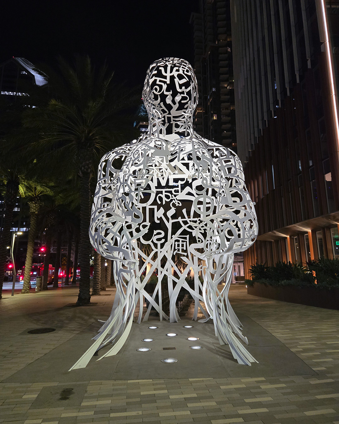
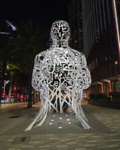
A figure built entirely out of letters from different alphabets. It’s typography as structure, and it reads even better at night, when the white lets the dark show through. Pacific Soul, is the work of internationally renowned Jaume Plensa, in downtown San Diego.
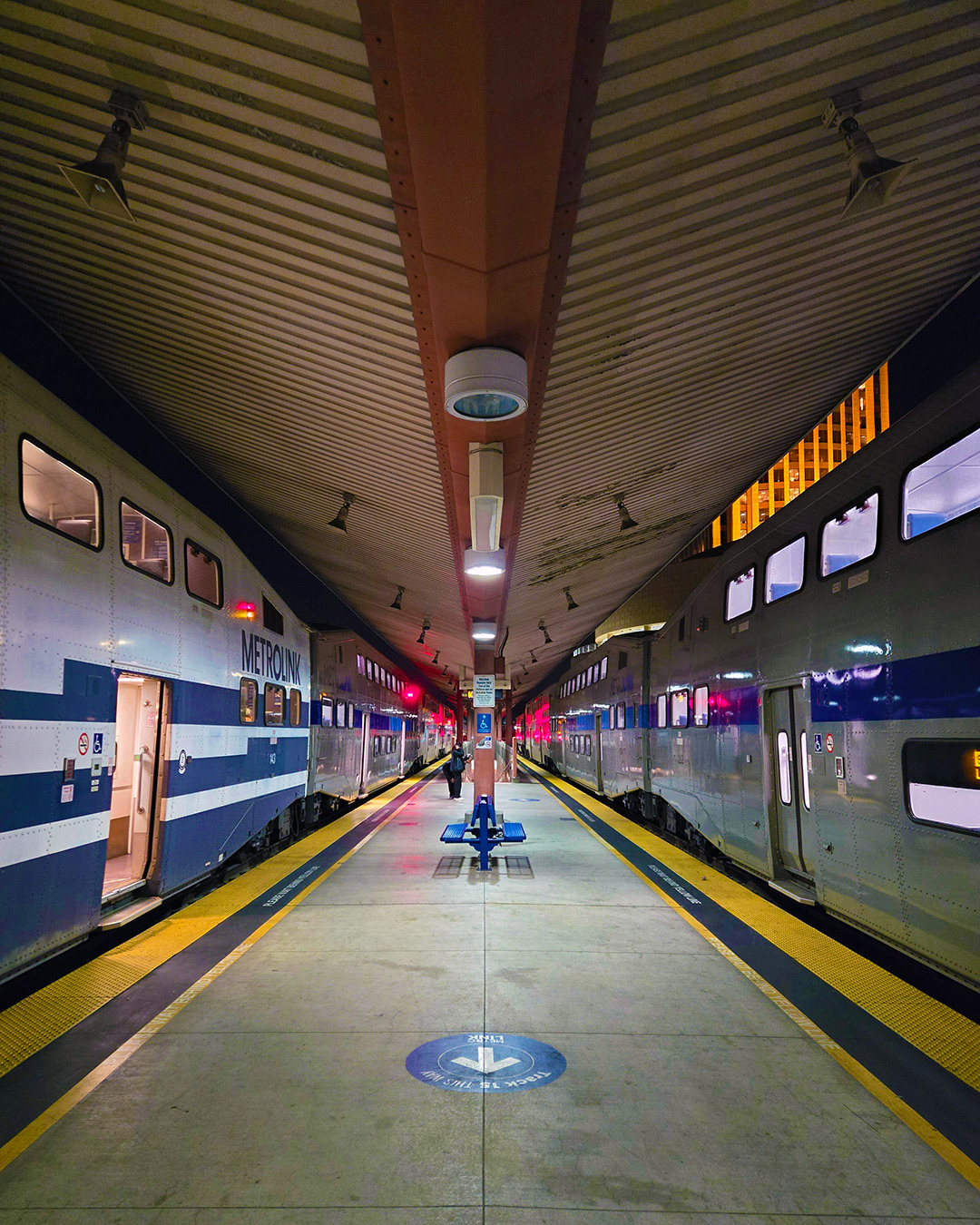
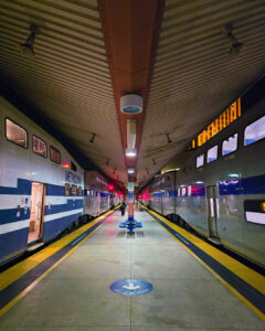
Symmetry, after hours. The yellow safety edges and a floor decal handle the wayfinding, and nothing else needs to.
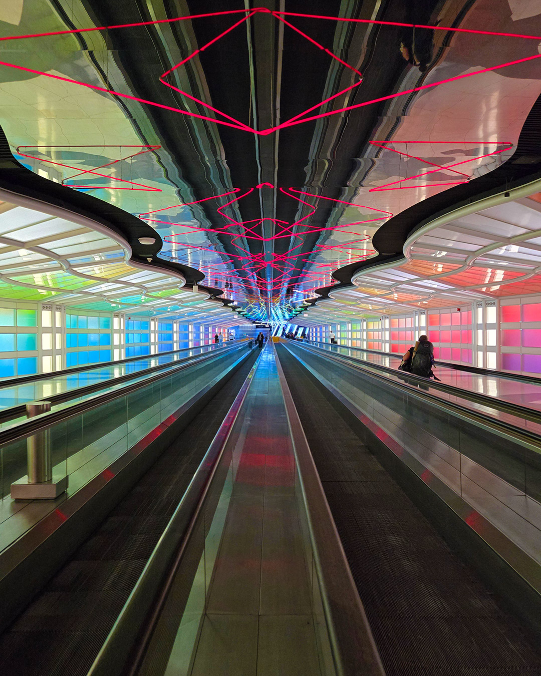
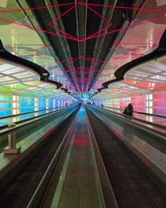
A walkway at Chicago O’Hare that many normally rush through, turned into the best part of the trip. Neon and color-shifting panels make a transit corridor feel like a destination.
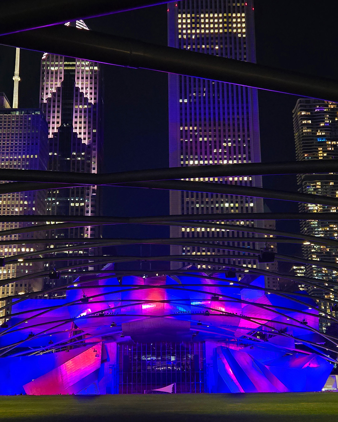
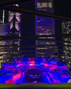
Steel trellis in the foreground, colored light on the pavilion, towers behind. Three layers of structure, framed by a fourth. A night on the town in the Windy City.
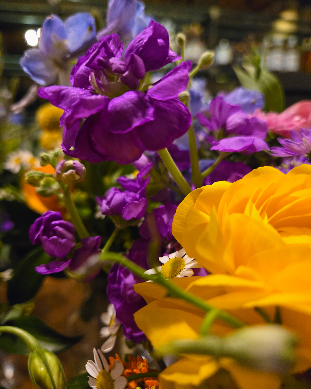
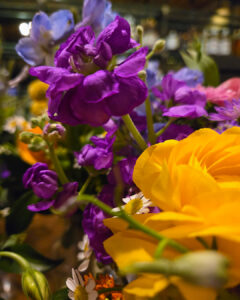
Purple against yellow, straight from the color wheel. A florist’s arrangement, and a decent lesson in complementary palettes.
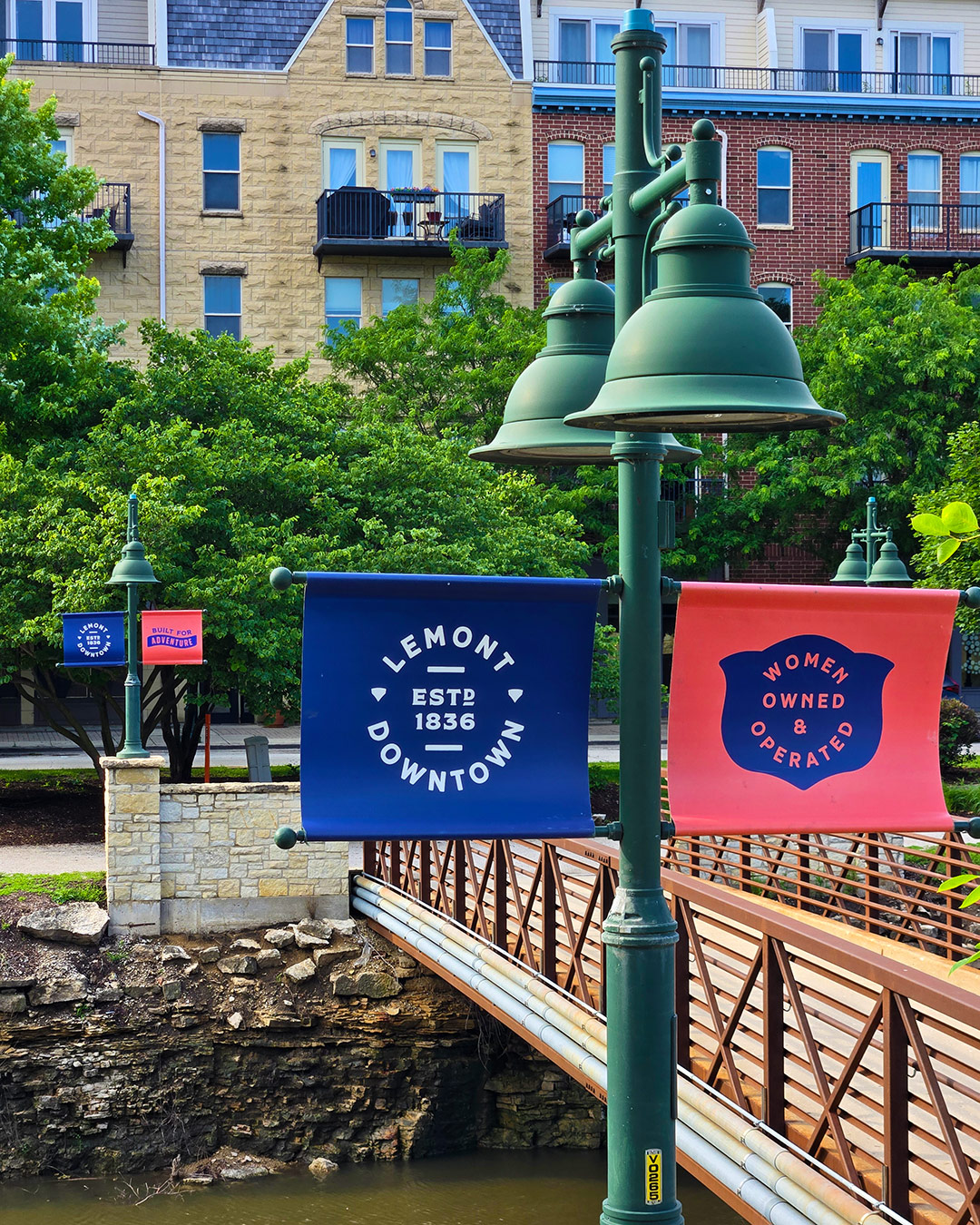
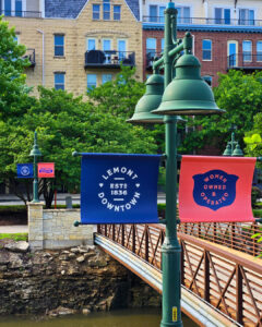
Two colors, one badge system, and it repeats throughout downtown Lemont, Illinois. The “Estd. 1836” roundel does more for a small downtown’s identity than a logo ever could.
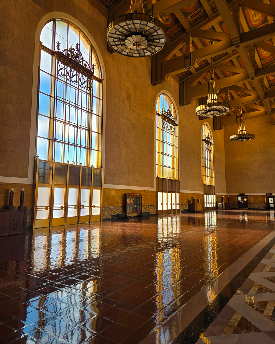
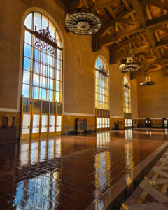
Afternoon light pours through the historic arched windows and lands on the floor tile a second time. Nobody had to add anything to make this room feel considered.
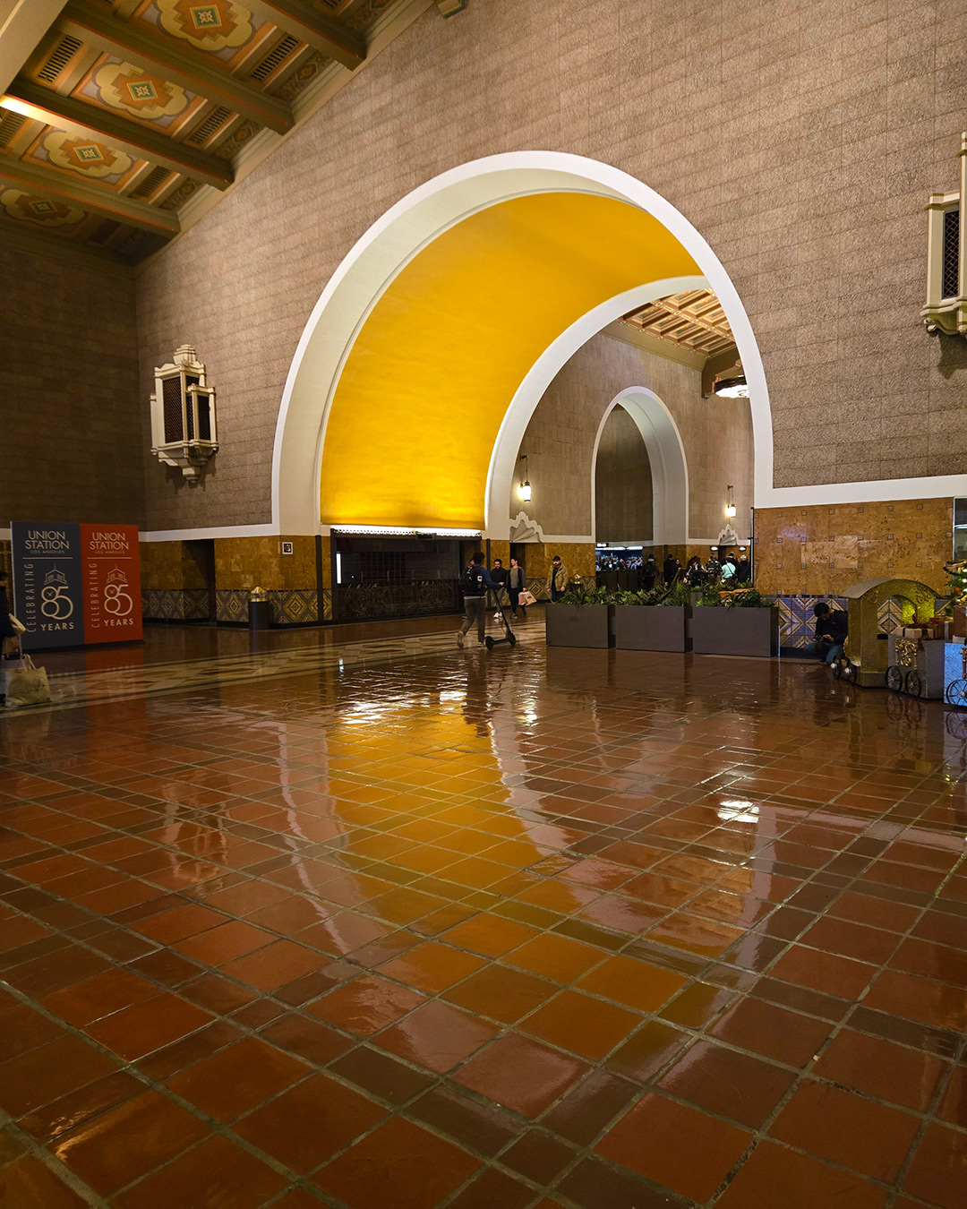
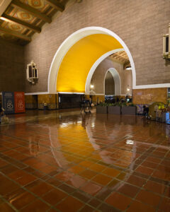
Eighty-five years in, the palette still holds. That golden arch, the terracotta floor, and a reflection that doubles the effect.
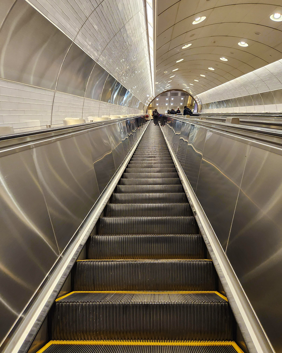
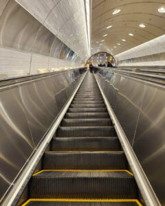
Stainless steel, white tile, and one very long escalator. The only color in the frame is the yellow safety edge on each step, and it’s enough.
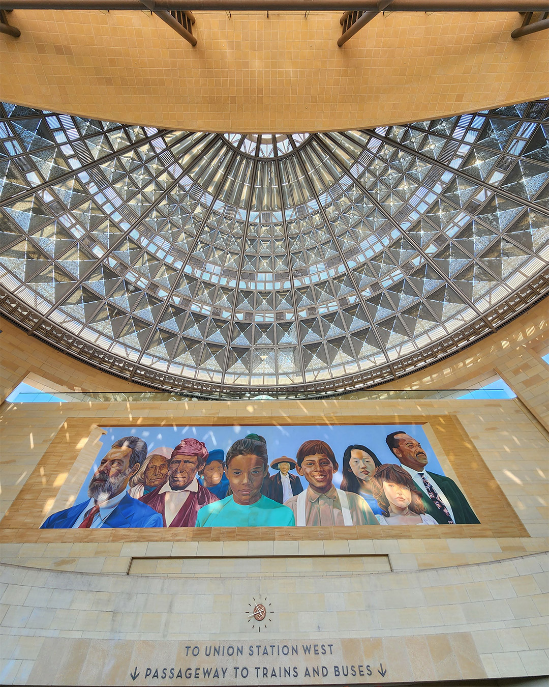
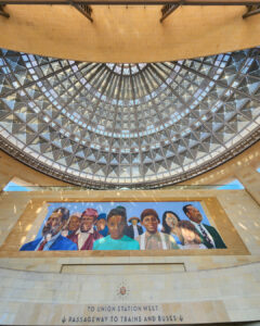
The dome gets the attention, but the sign is doing the real work. Simple caps, two arrows, and no doubt about where the trains are.
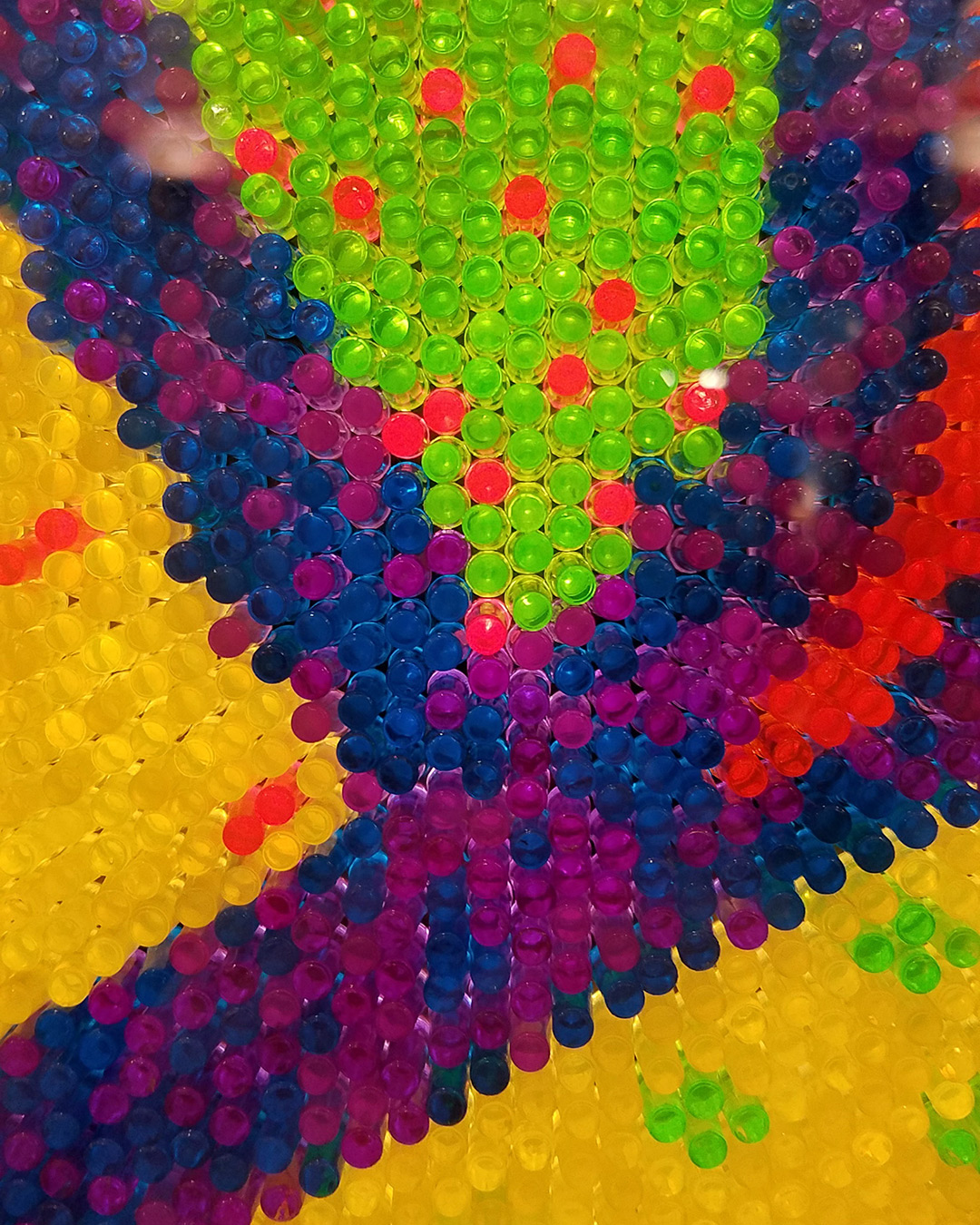
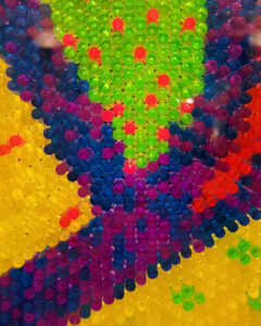
Art at the St. Paul Union Depot. Color at its most unfiltered. Hundreds of tiny translucent pegs, each doing one very small job, add up to a burst.