Building Brand Systems That Scale Across Hundreds of Libraries
The Challenge
California Libraries Learn (CALL) is a collaborative initiative of the California State Library and California Library Association, providing professional development and resources for library staff statewide.
The challenge: Create a distinct brand identity that would work for a program serving hundreds of libraries across California’s diverse communities—from major urban systems to small rural branches—while ensuring non-designers could implement the brand consistently.
CALL needed more than a logo. They needed a complete brand system that could scale.
The Strategy
Rather than creating rigid brand guidelines that require designer involvement for every application, I developed a flexible framework that empowers library staff to confidently create brand-compliant materials.
The strategic approach:
- Scalable system: Design elements that work from small branches to large metro libraries
- Non-designer friendly: Clear guidelines anyone can follow without design expertise
- California identity: Visual language rooted in the state’s landscape and diversity
- Flexible implementation: Consistency without sacrificing local adaptation
The Solution
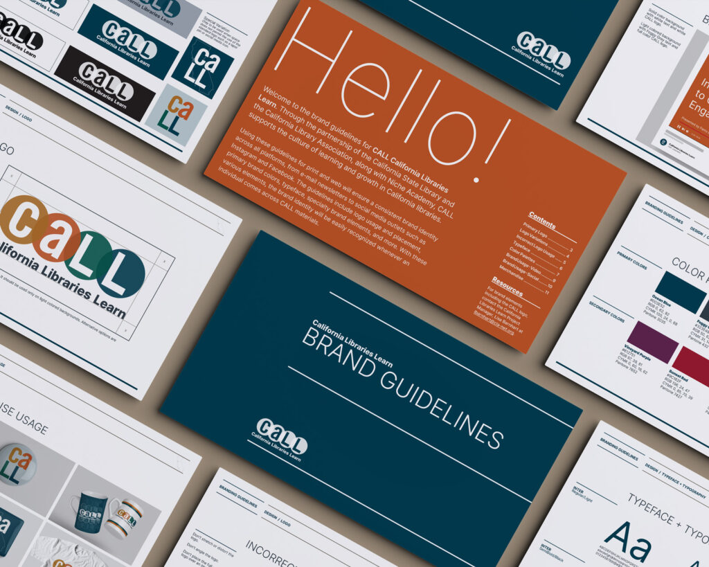
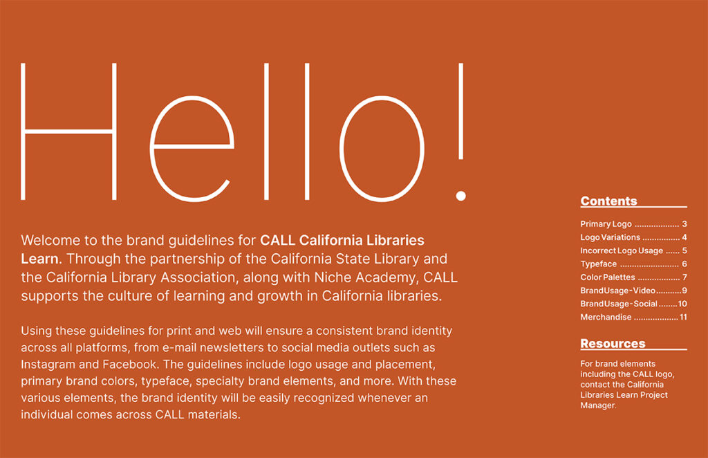
I created comprehensive brand guidelines serving as the complete visual identity system for the statewide program:
Brand Identity Development:
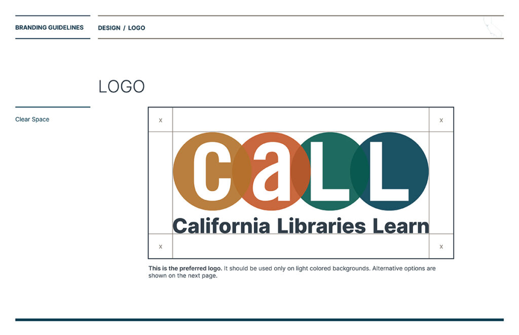
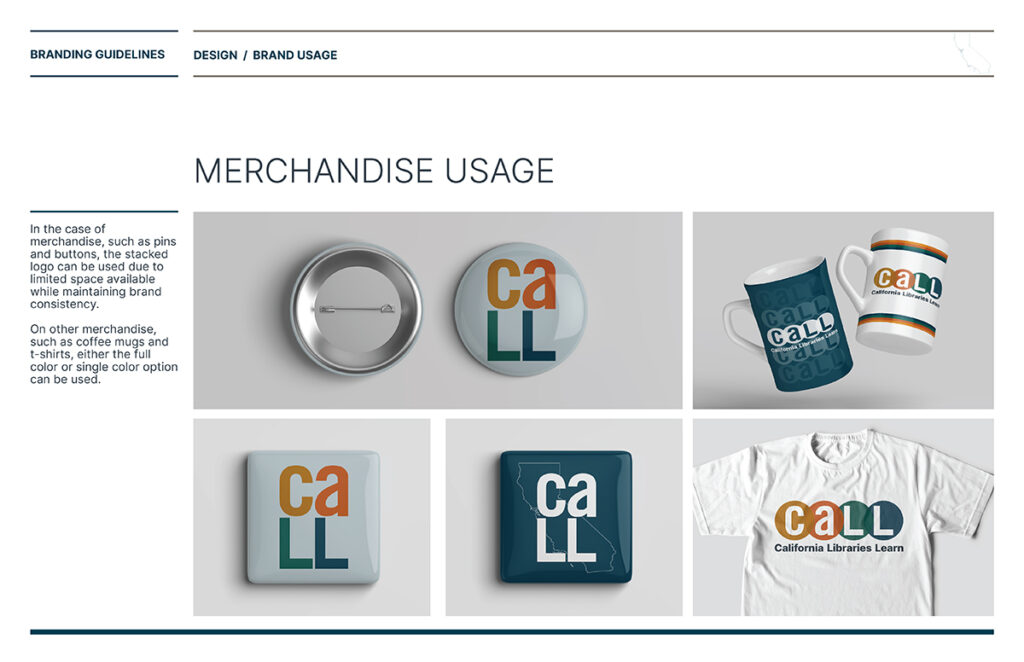
Complete logo system with variations for different applications
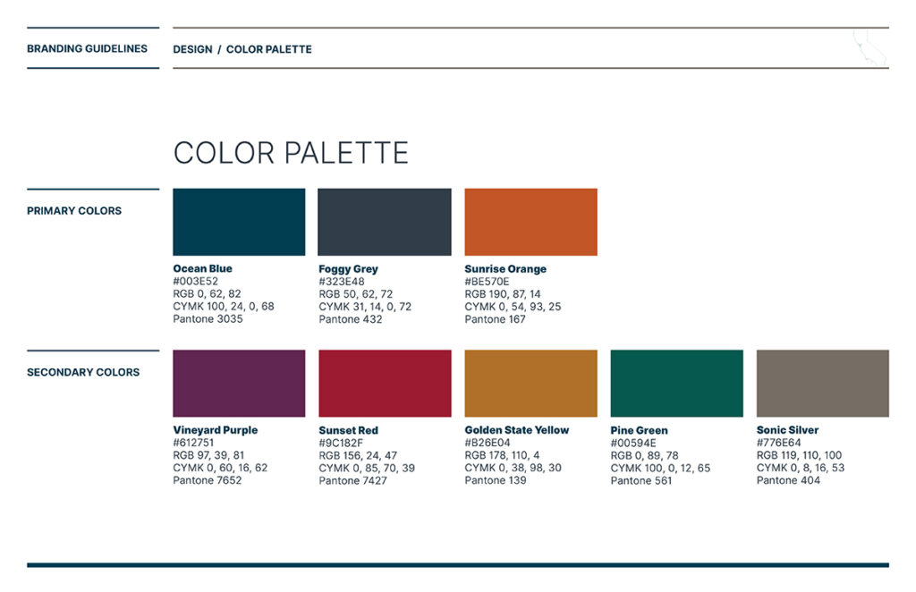
Strategic color palette (Ocean Blue, Foggy Grey, Sunset Orange, Forest Green) inspired by California’s natural landscape
Typography system built on Inter typeface for modern readability and accessibility
Visual language balancing professionalism with approachability
Brand Guidelines Documentation:
Logo usage rules and spacing requirements
Color specifications for print and digital
Typography hierarchy and usage standards
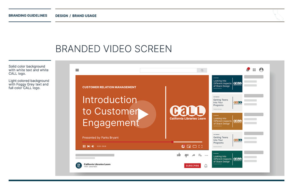
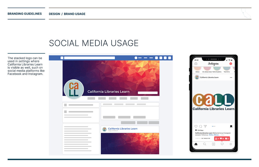
Application examples across common use cases
Clear do’s and don’ts with visual examples
Template Systems:
Frameworks for common materials (flyers, presentations, social media)
Adaptable layouts maintaining brand integrity
Guidelines for photography and imagery
Digital asset specifications
Why This Works
For Program Leaders: Confidence that brand integrity is maintained across the state without micromanaging every library’s materials
For Library Staff: Clear tools to create professional, on-brand materials without needing a designer for every project
For Communities: Consistent recognition of CALL programming regardless of location
What This Project Demonstrates
✓ Systems thinking – Creating frameworks that scale across diverse organizations
✓ Government program expertise – Understanding statewide coordination challenges
✓ User-centered design – Building tools for non-designers to use confidently
✓ Complete brand development – Identity through comprehensive implementation guidelines
✓ Strategic documentation – Guidelines that empower rather than restrict
Field
State Government, Non-Profit
Services
Brand Identity, Graphic Design, Strategy + Innovation, Digital Communications, Web Design


